


Nine times out of ten, my clients come to me (a brand and web designer) because they’re tired of blending in. They are done being passed by for someone else in their industry who isn’t necessarily better, just better represented.
And the frustrating part is that their logo isn’t bad. Often, it’s really nice! But it’s simply not enough to communicate what sets them apart and garner enough attention for their ideal clients to learn more about them.
Your logo is like a uniform, like the one I had to wear in high school. But even teenage me understood that wearing a uniform didn’t mean I had to blend in! I’m talking ribbons in my hair, a sparkly keychain on my backpack, and earrings that showed my style. (Is it any surprise that I’m now a designer who specializes in bold, out-of-the-box logos and branding?)
Your logo is the same. On its own… It’s just a logo. Nothing about it is special or recognizable. But pair that logo with the right fonts, colors, and voice, and you’ve got yourself a distinct visual identity that can resonate with your ideal audience.
So if a logo isn’t enough to make your brand stand out, what do you actually need? That’s the question this blog is going to answer, so keep reading to learn everything you need to make your brand shine (just like my hair ribbons did in high school).
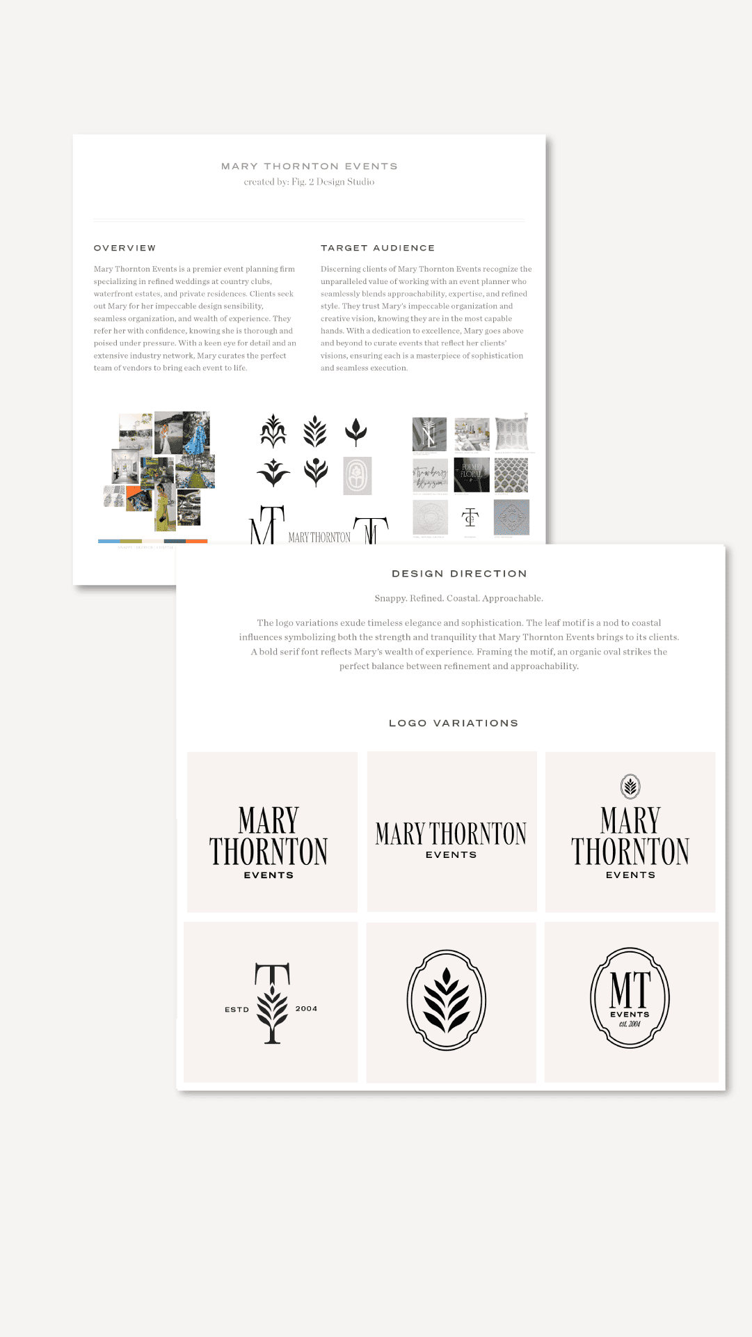
The Essential Pieces of a Modern Visual Identity
Logo
A logo might not be enough on its own, but you do still need one. Your logo is your main identifier. Sometimes it’s an image, sometimes it’s just text, and sometimes it’s a combination of the two. Either way, it is the mark you use across all platforms to identify your business.
For example, Google’s logo is simply the word Google. But it’s in a specific font and color scheme, making it instantly recognizable. Nike’s logo, on the other hand, is a symbol: a swoosh. No words, no text, but the message is the same.
Submarks
A submark is your logo, simplified. If your logo is your business name, your submark might be a stylized version of the first letters. If your logo is an image, your submark might be a single element from that image. Submarks are used in smaller spaces, like the little icon in a website’s tab. It uses the same colors and typography as the rest of your brand, making sure everything feels cohesive.
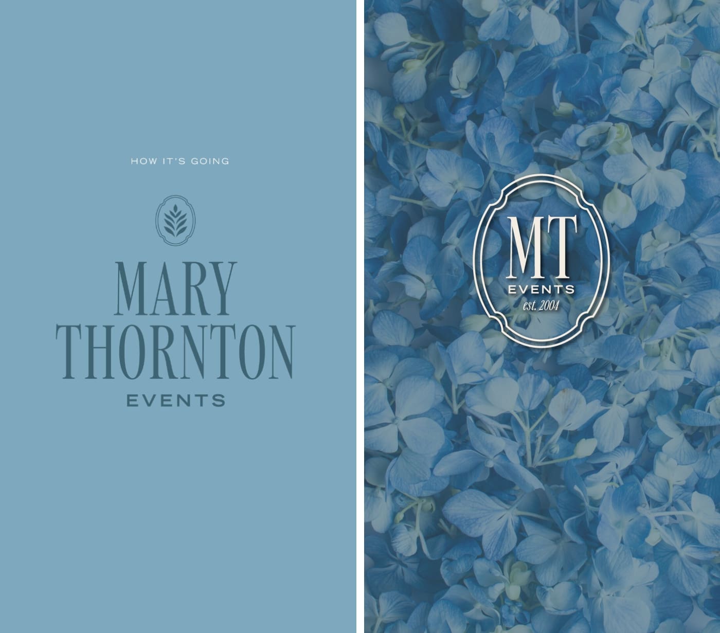
Typography
Typography is all about your fonts and how you use them. If every page on your website used a different font, it would feel jarring and, if we’re honest, unprofessional. Your typography gives you a few fonts that feel unique to you, so you can use them consistently across platforms.
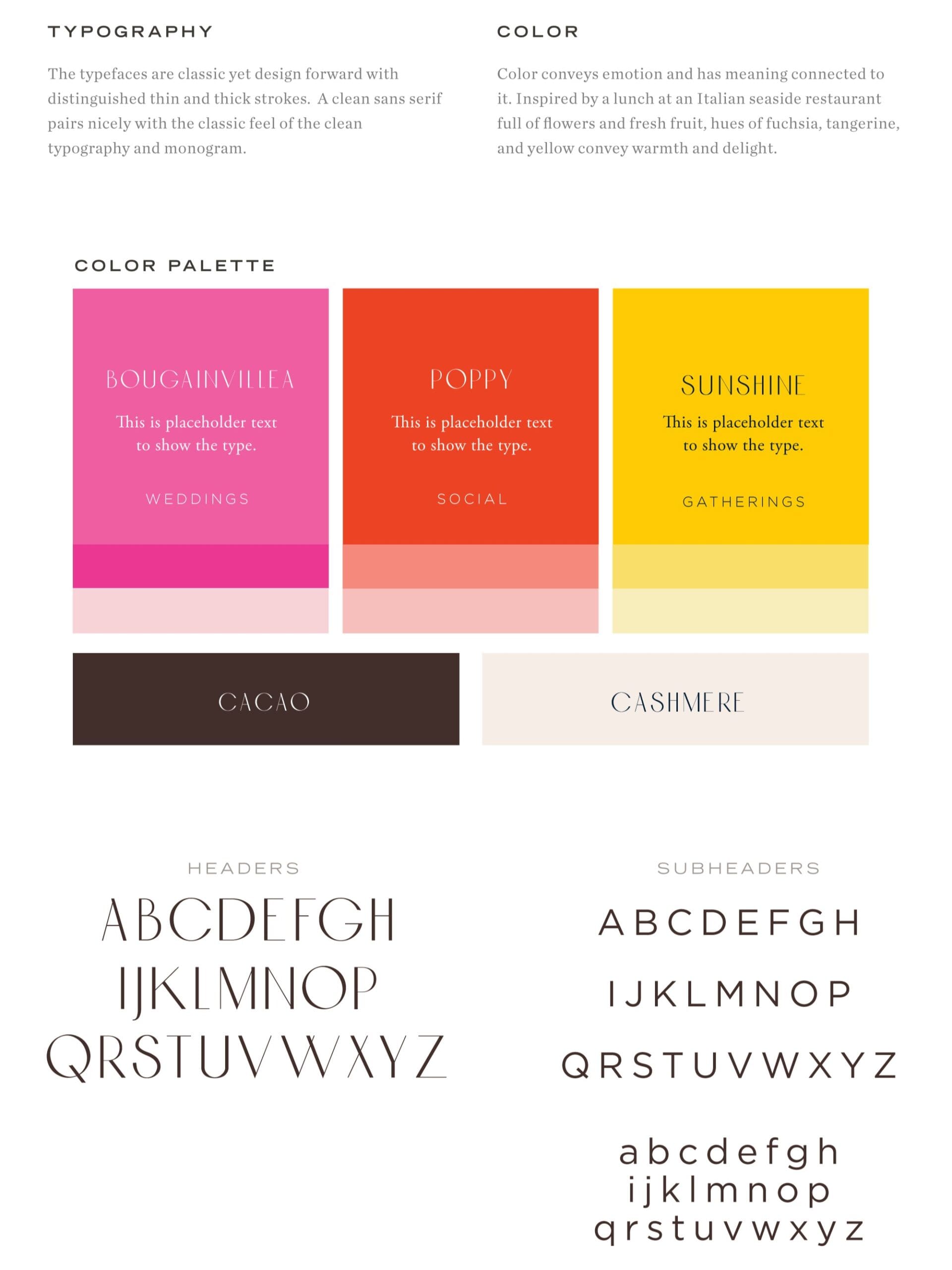
Color Palette
This is where everything comes together! Color conveys emotion, and the colors you use in your brand determine how people feel when they see it. Depending on the colors you use, your brand can feel bold and edgy, subtle and sophisticated, trustworthy and approachable… the options are endless.
Everything above, from your logos and submarks to the text on your website, will be in your brand colors. This makes sure that your brand becomes linked to certain colors, and every time someone sees those colors, they think of you!
Together, your logo, submarks, typography, and colors create a foundational visual identity. And all of these things are included in my Branding VIP day! Because you don’t need to wait two months to get a clear, cohesive brand that makes your business stand apart from the crowd.
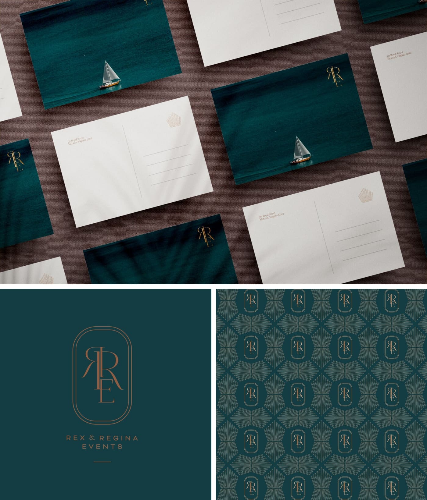
(Bonus!) Patterns & Icons
If you want to really elevate your brand and go beyond the basics, the best way to do that is with patterns and icons. These details are often hand-drawn and can take time to develop, but trust me, the payoff is worth it. Patterns and icons pair particularly well with business cards, custom stationery, labels, and other tactile items.
If you want to learn more about patterns and icons, check out the Full Brand Identity package!
How to Use Your Visual Identity in Real Life
Have you ever opened Instagram, seen a post, and known exactly who shared it without ever looking at their avatar or handle? That’s because they’re using recognizable fonts, images, and colors. That is a visual identity in action.
Your brand should have that same level of instant connection. And the only way to achieve that is through consistently. Use the same logo or image as your bio picture across Instagram, Facebook, Google, etc! Make sure your website matches your social media! If you send stationery, use your brand colors—not some random orange envelope you found in your desk drawer.
Cohesion and consistency are the two most important elements of using your brand.

Invest in Your Visual Identity With a Custom Logo & Branding
In an era of oversaturation and digital fatigue, your brand needs to do some pretty heavy lifting. Luckily, a well-designed logo and brand is more than capable of distinguishing you from your competitors and attracting your ideal clients!
So, are you looking to quickly and efficiently build the foundations of your brand with a VIP day, or do you want to develop an extensive visual library with the Full Brand Identity package? Either way, the next step is to fill out the form so we can discuss your vision! I’m so excited to help you create a strong, customized brand that feels aligned and unique.


